copy

CASE STUDY · SELF-INITIATED

Widi Interior, a studio site where the photography does the talking

A self-initiated concept for a Bali interior design studio, treated like a real commission. Full-bleed photography, editorial type and a page transition system built with Next.js App Router, GSAP and Lenis. Designed and built end to end.

Concept Build Next.js App Router GSAP + Lenis Art Direction View Transitions

ROLE

Design and build

SCOPE

Concept to deployment

STACK

Next.js, React, GSAP

SECTOR

Interior design, hospitality

Widi Interior homepage

OVERVIEW

A concept, held to the standard of a client job

Interior and villa work is sold on atmosphere. A studio in Bali competes with hundreds of others showing the same stone, the same rattan, the same infinity pools, so the site cannot win on features. It has to win on how it feels to move through it.

This is a self-initiated concept, not a commissioned project, and I say that plainly because it matters. What I wanted to test was whether the kind of site usually reserved for a big studio budget, with a full route structure and a considered transition between pages, is now something one designer can ship in days with AI in the loop.

Six routes, a data-driven project index, an art directed photo system and a custom preloader. Live at widi-interior.vercel.app.
ART DIRECTION

What makes it feel like the island

Photography sets the grid, not the other way round

Every layout is built around the image proportions, so full-bleed photos run edge to edge and captions sit in the negative space. The typography steps back rather than competing for attention.

A serif for the voice, a sans for the detail

A high contrast serif carries the headlines and the studio tone. Small sans labels handle materials, dates and captions. Terracotta is the only accent, used sparingly on actions and never on body text.

Trips between pages, not page loads

Native view transitions handle navigation, so moving from the project index into a project keeps continuity instead of flashing white. Lenis smooths the scroll and GSAP drives reveals, with ScrollTriggers cleaned up on every route change.

A preloader that earns its place

The opening counter gives the hero photography time to decode before it is revealed, and it sets the pace for the whole site. It exists because a full-bleed image arriving half loaded would undo the art direction.

STRUCTURE

Six routes, one content model

Home

Hero, studio figures, what we do, how we work, featured work and client reviews in one scroll, with the primary action always in reach.

Spaces

The project index, driven by a single data file with categories, location, date and client details for each space.

Space detail

A dynamic route per project: story, spatial qualities, materials and natural elements, then the next project as a hand-off.

Studio

The team, the philosophy and the numbers, laid out as an editorial read rather than an about page template.

Blueprints

The four stage process, from discovery and site visit through to build and reveal.

Connect

Enquiries and commissions, with the studio address in Ubud and direct social links.

SELECTED SCREENS

Editorial pacing, page by page

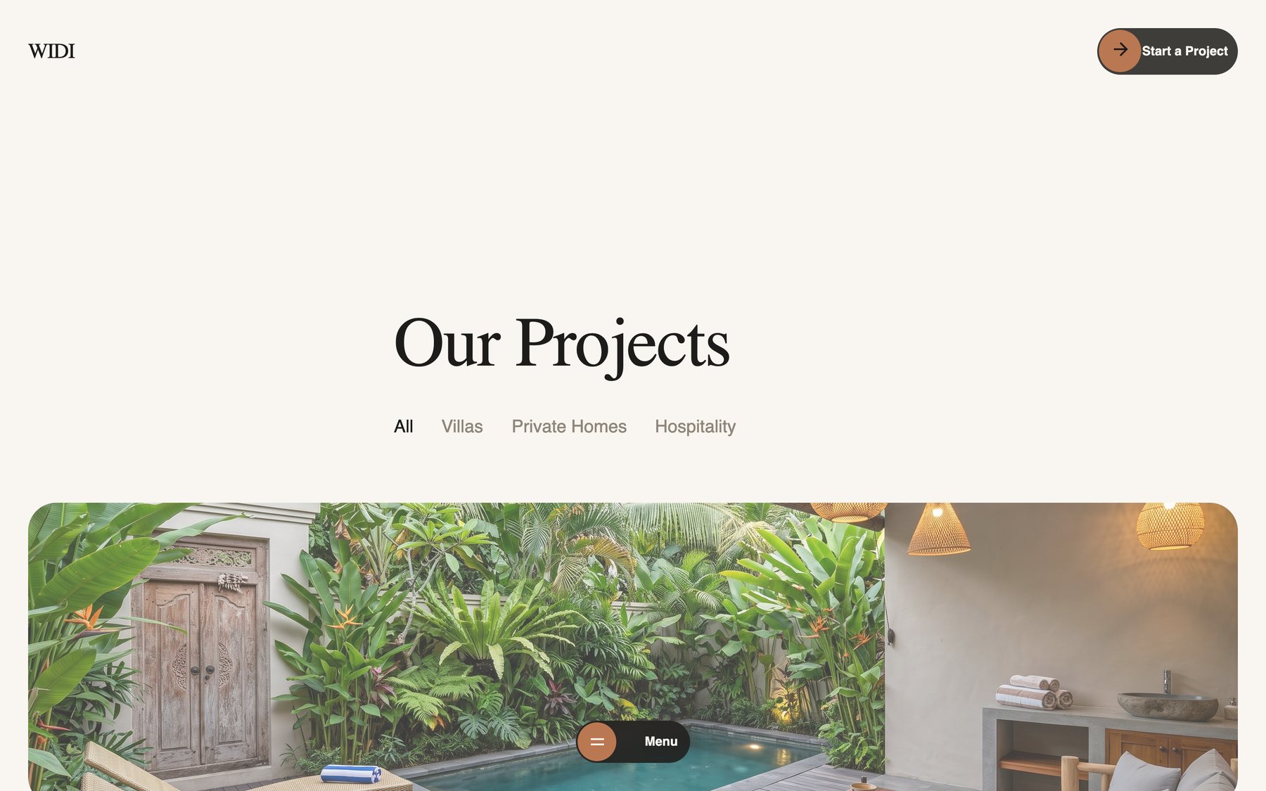
Widi Interior project index page

Project index

Full-bleed project covers with the name, location and year on the image, so browsing feels like flipping through a portfolio.

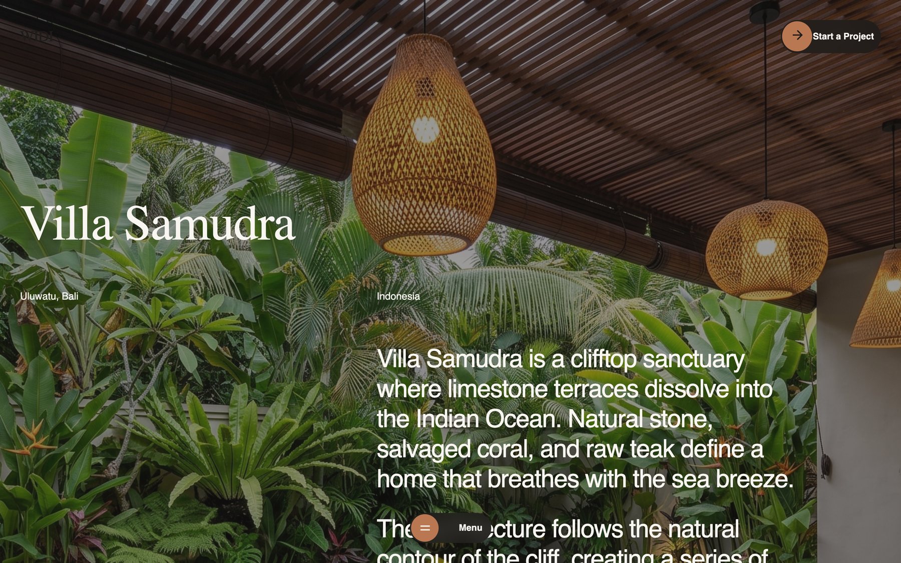
Widi Interior project detail page

Project detail

Story, collaborators and materials, then a quiet hand-off to the next space. Every project inherits the same layout from one data file.

How we work section with material tags

How we work

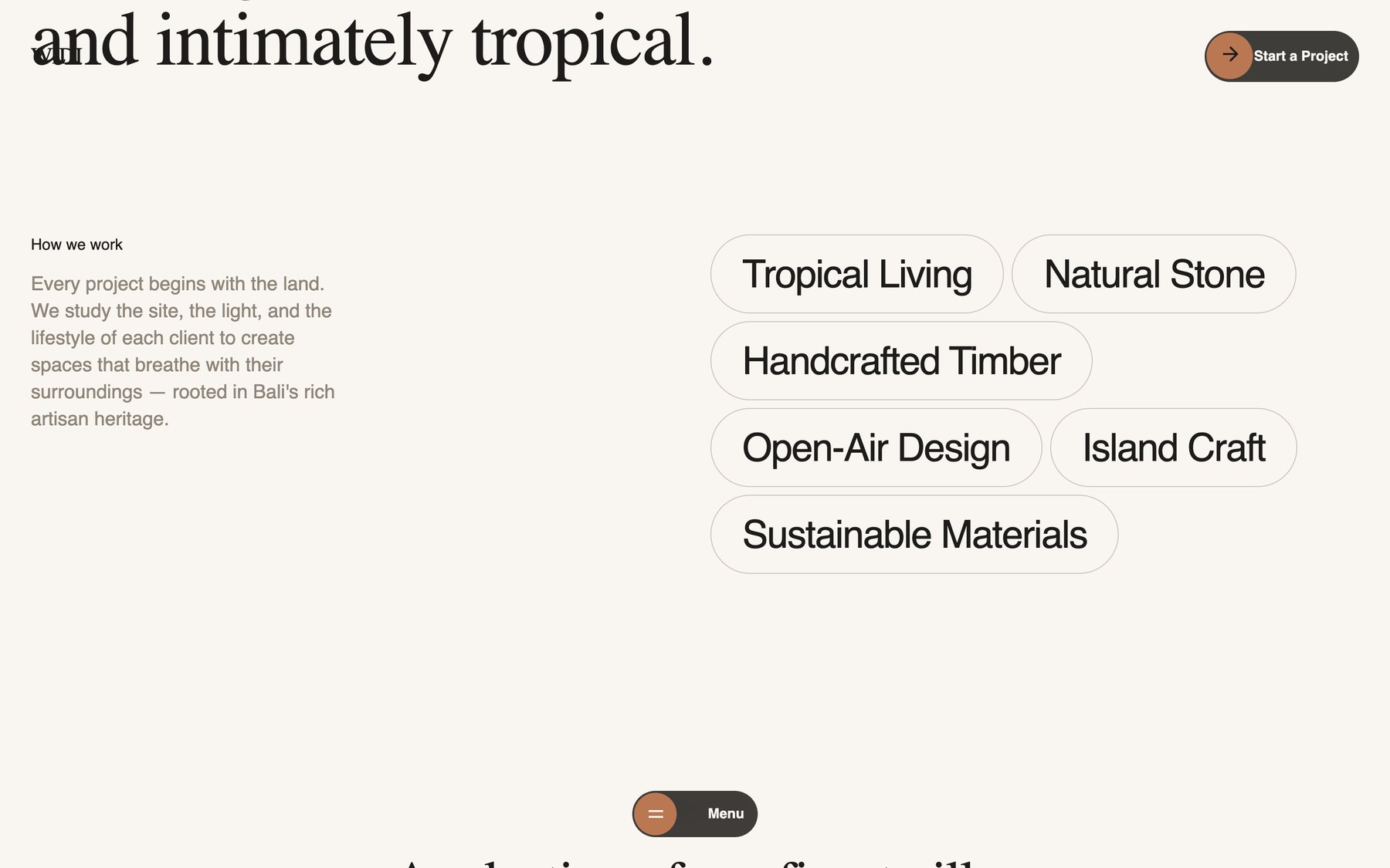
Material and approach tags as pills against a serif statement. The type does the storytelling, the tags carry the detail.

Widi Interior studio page

Studio

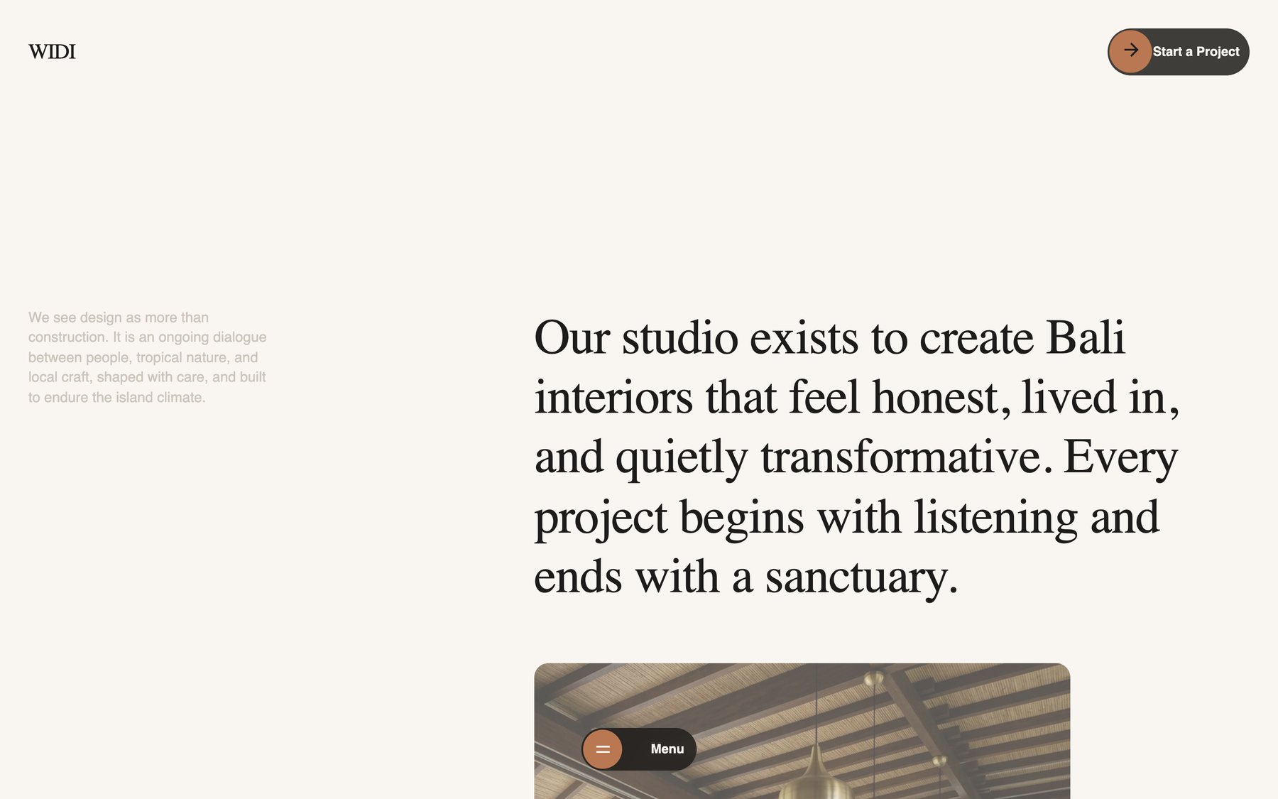
Portrait photography and a slow, editorial read, closer to a magazine feature than a company profile.

Widi Interior hero with overlay typography

Hero

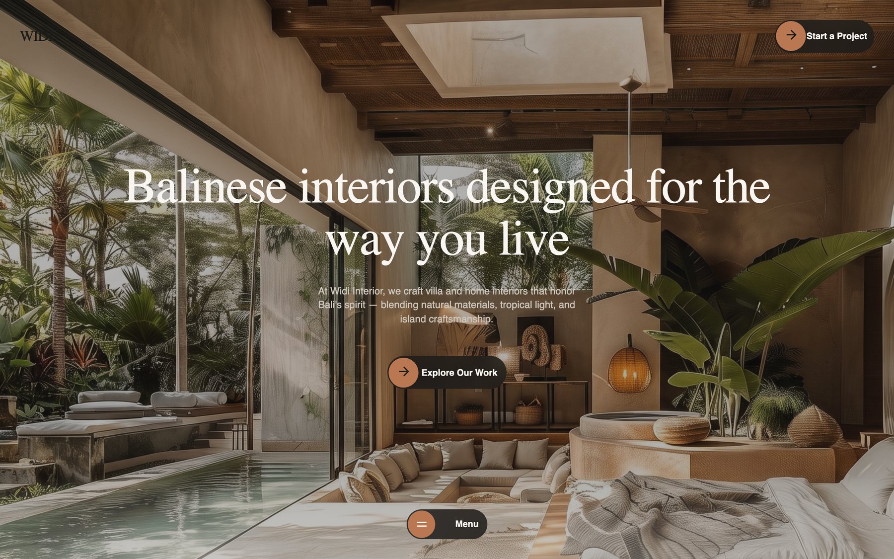
Text sits directly on the photograph with a floating pill navigation, so there is no chrome between the visitor and the room.

Widi Interior on a phone

Mobile

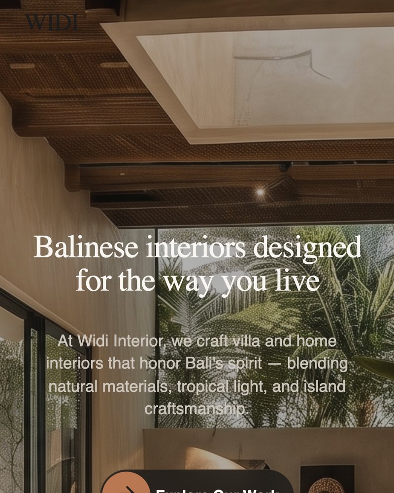
Full-bleed imagery holds up on a phone, with the navigation collapsed into a single pill and the action always visible.

WHAT THIS PROVES

The parts a hiring team actually checks

Modern front end, not a page builder. Next.js App Router, dynamic routes for project pages, and a shared layout that keeps the shell stable between navigations.

Motion engineering. GSAP timelines, ScrollTrigger with explicit cleanup on route change, Lenis smooth scrolling and native view transitions. Each effect exists to serve the reading order.

Art direction. Type pairing, a single accent colour, image-led composition and a consistent treatment of captions across every route.

Content modelled, not hardcoded. Projects come from one data file, so adding a new space is a content edit rather than a design job.

Built fast with AI in the loop. Structure, components and motion were drafted with AI assisted tooling, then reviewed and corrected by hand. A build that would have taken weeks of back and forth shipped as a working concept in days, which is the actual argument for an AI native workflow.

Responsive down to 390px. Full-bleed photography, floating navigation and the preloader all adapt rather than being switched off.

NEXT PROJECT

SpareParts Management System →

Enterprise dashboard for manufacturing operations